


 Hergestellt & handgefertigt in Großbritannien
 Kostenlose Lieferung innerhalb Großbritanniens für alle Bestellungen
Wall Art Trends 2026: What We're Seeing This Year
Every year I get asked the same question: what's trending in wall art right now?
Honestly, trends in abstract art move slower than people think. The colours shift, the framing preferences evolve, but the fundamentals — choosing something that makes you feel something when you walk into the room — that doesn't change.
That said, 2026 has brought some clear shifts. I see it in what our customers are ordering, what interior designers are specifying, and what keeps showing up across the homes I see on Instagram every week. Here's what's actually happening.
Earthy neutrals are everywhere (and they're not boring)
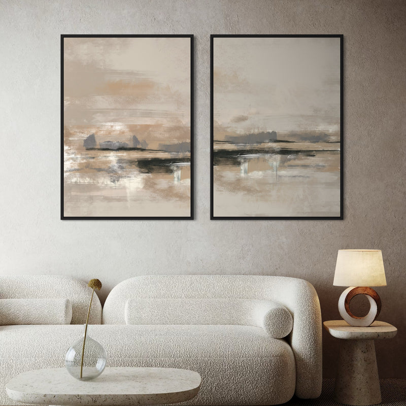
Sage, terracotta, clay, warm taupe — these tones have been building for a couple of years now, and in 2026 they've properly taken over. It's not just paint colours either. People want their wall art to feel like it belongs to the room, not like it was dropped in from somewhere else.
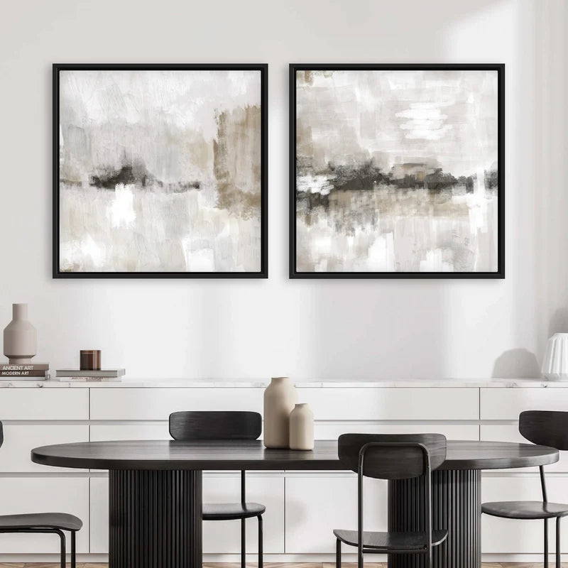
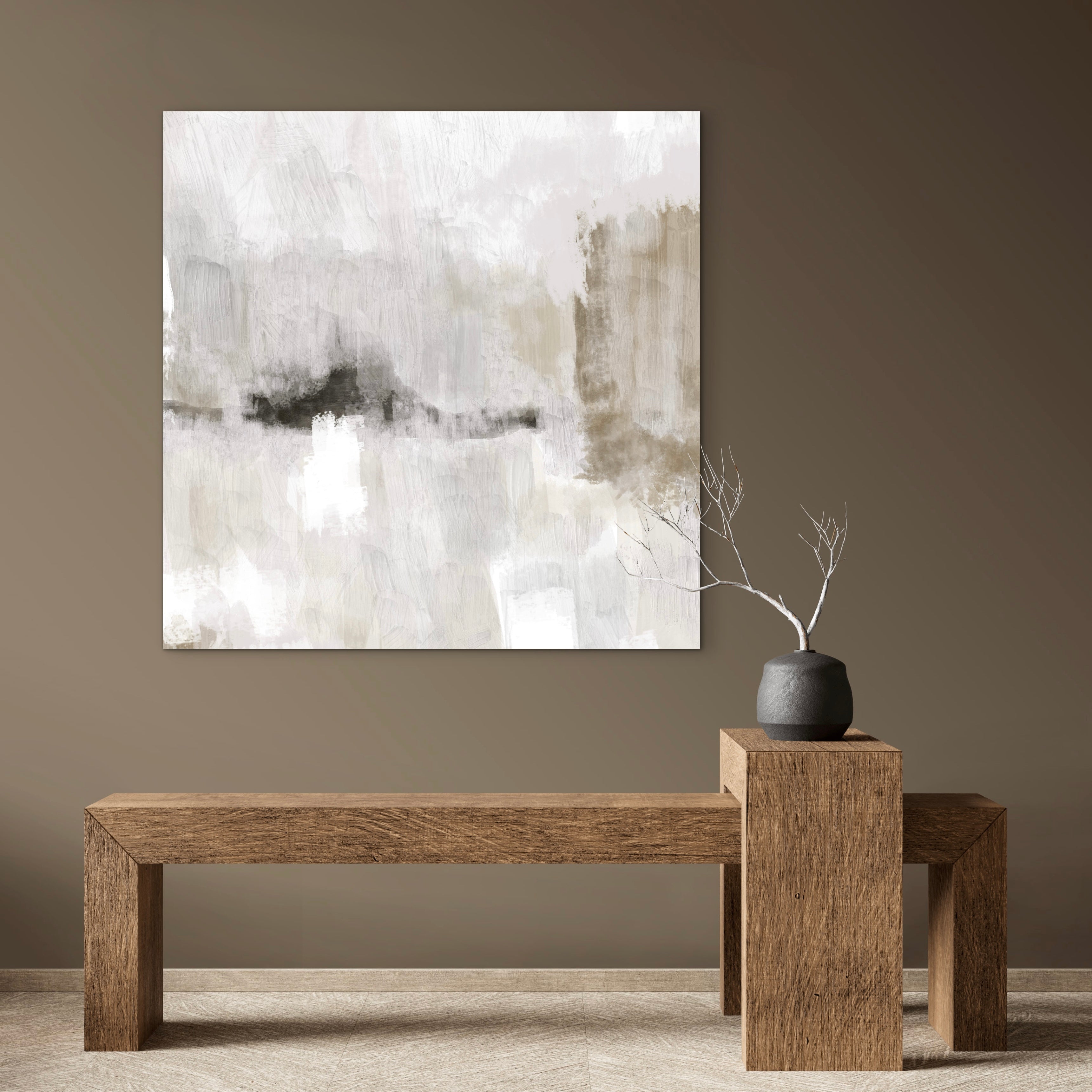
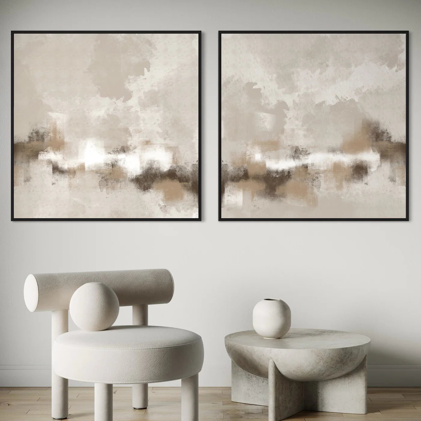
What I've noticed is a move away from cool greys toward warmer undertones. Beige used to feel dated; now it feels considered. Our Calm Serenity set is a good example — cream, taupe, and soft grey layered together. It's been one of our best sellers this year precisely because it sits comfortably in rooms that have embraced that warm, grounded palette.
If you're working with earthy walls or wooden furniture, abstract art in this range doesn't compete with the room. It completes it.
Gold accents are back (subtly)
Not the loud, shiny gold of ten years ago. This is brushed, muted, almost sandy gold woven through softer compositions. Think of it as warmth with a bit of depth.
I designed our Gold Serenity triptych with exactly this in mind — warm gold tones mixed with cream and soft brown. It catches the light differently depending on the time of day, which is something you only get with canvas rather than flat prints on paper.
If you want to add a touch of warmth without going full glam, gold-toned abstract art paired with a natural wood frame is probably the most effective combination I've seen this year.
The gallery wall has loosened up
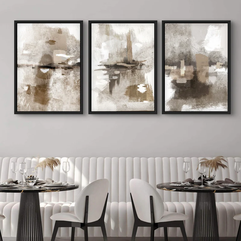
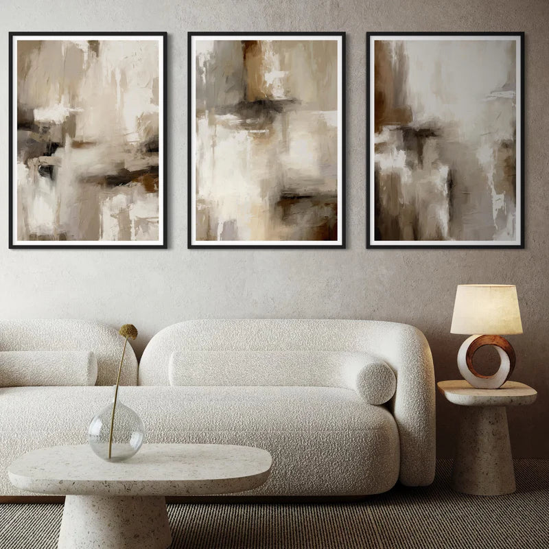
Gallery walls aren't going anywhere, but they've changed. The perfectly symmetrical grid of matching frames? That's starting to feel a bit stiff. What I'm seeing more of is what Ideal Home recently called "everyday exhibits" — mixing different sizes, different frame finishes, and building a wall that looks like it was collected over time rather than ordered in one go.
This is actually one of the reasons we offer our pieces in sets of three and sets of two as well as singles. A set gives you cohesion — the colours work together, the compositions are designed as a group — but you can hang them with space between, mix in a mirror or a shelf, and it still holds together.
The trick is keeping at least one element consistent across the wall. That might be colour palette, frame finish, or subject matter. Without that thread, it just looks cluttered.
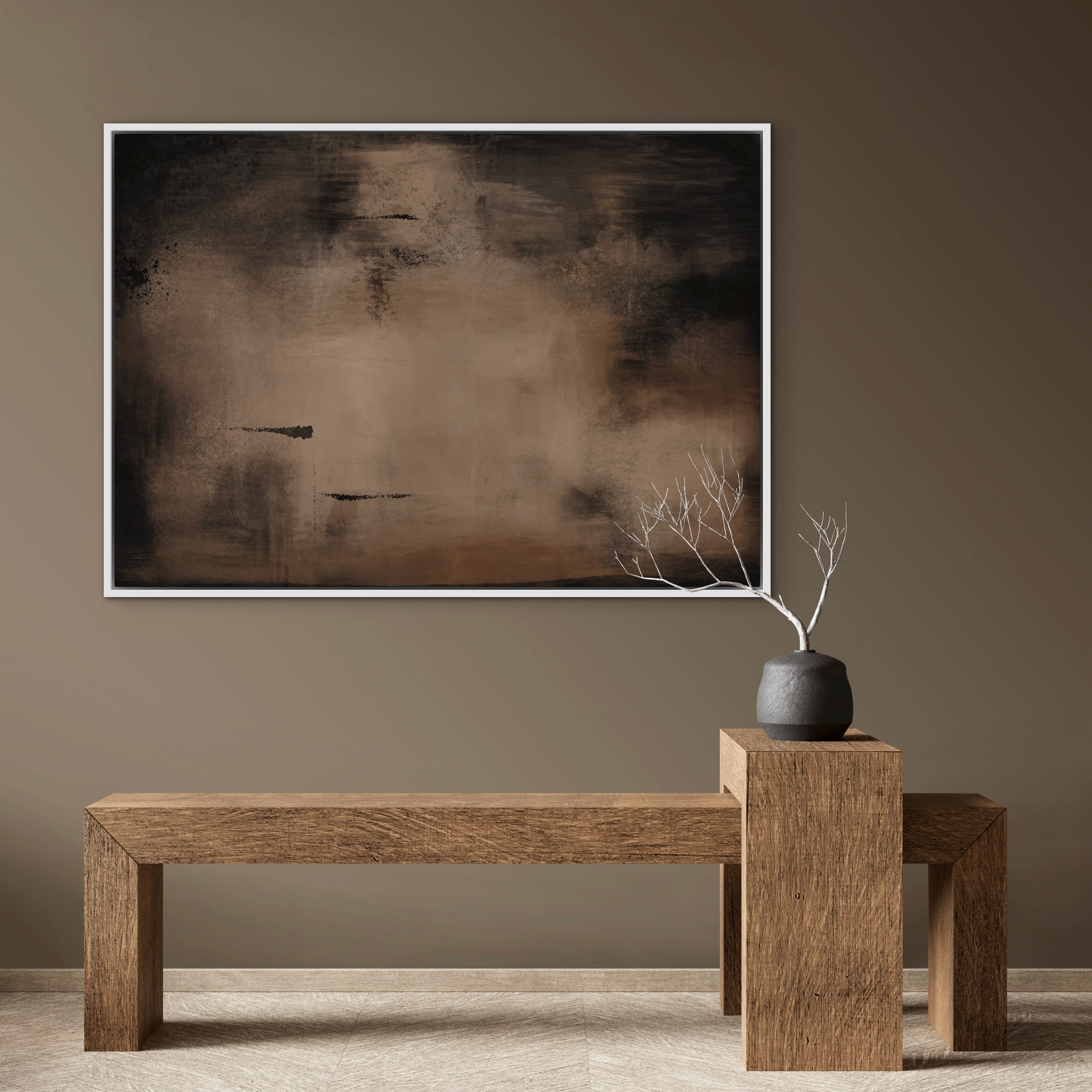
Oversized single pieces for smaller rooms
This one surprises people. You'd think a small room needs small art, but actually the opposite often works better. One large piece creates a focal point and makes the wall feel intentional, whereas three or four small pieces can make a compact room feel busy.
A panoramic canvas like our Coastal Whisper — 100cm wide but only 50cm tall — is ideal above a sofa or bed in a room where you don't have a lot of vertical space. It draws the eye across rather than up, which makes the room feel wider.
Greens and teals are the new accent colours
Blue was the accent of choice for years. In 2026, green has overtaken it — deeper, more natural-feeling tones like forest, teal, and olive. It ties into the broader biophilic design trend, where interiors borrow from nature rather than ignoring it.
Our Venice set captures this well — green and teal layered with warm beige and cream. It's abstract enough that it doesn't feel like a landscape painting, but the tones are unmistakably rooted in the natural world.
If your room is mostly neutral, a piece with green undertones is probably the easiest way to introduce colour without it feeling like a statement.
Framed canvas over unframed prints
This isn't really a trend — it's more of a permanent shift I've watched happen over the past two years. People are choosing framed canvas over unframed paper prints, and I think there are two reasons.
First, framed canvas arrives ready to hang. No trip to the framer, no extra cost, no waiting. Second, canvas has texture that paper doesn't. Light catches the surface differently, the colours have more depth, and it simply looks more considered on the wall.
We've always focused on framed canvas for exactly these reasons. Every piece we make comes in a solid wooden frame — black, natural, or white — and it's ready to go straight onto the wall.
What does all this actually mean for your home?
Trends are useful as a starting point, but the best wall art is the piece that makes you stop for a second when you walk past it. If earthy neutrals feel right for your space, lean into that. If you want a bold green accent, go for it. The worst thing you can do is choose something because a trends article told you to.
What I always tell our customers: pick the piece that you keep coming back to. If you've been looking at it for a few days and still like it, that's the one. Trends come and go. Good art on your wall doesn't get old.
Browse our full collection at hdlondonart.com.