


 UK Made & Handcrafted
 Free UK Delivery
How to Create a Gallery Wall with Abstract Art
How to Create a Gallery Wall with Abstract Art
There's a moment — usually somewhere between your third cup of tea and your tenth scroll through interiors accounts — where the idea lands: I want a gallery wall. And then, almost immediately, the doubt creeps in. Where do I start? What if it looks messy? What if I hammer seventeen holes and hate the result?
Here's the thing. A gallery wall with abstract art is one of the most forgiving, rewarding projects you can take on. Abstract pieces don't need to "match" in the way landscapes or portraits do. They work on colour, texture, and feeling — which gives you far more freedom than you might think. Let's walk through exactly how to do it well.
Start with the Wall, Not the Art
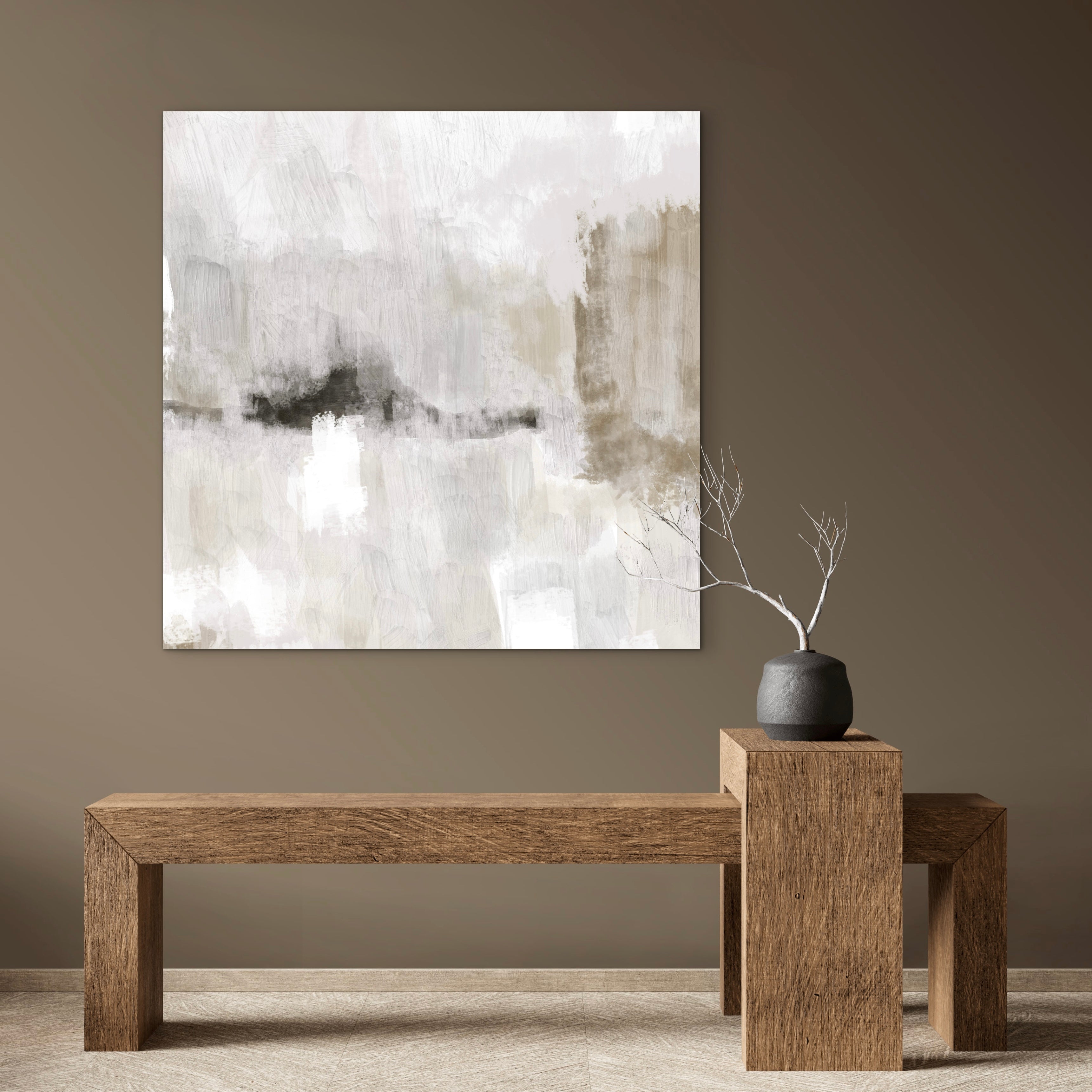
This is where most people go wrong. They fall in love with a piece (understandable) and then try to force it onto a wall that doesn't suit it. Instead, start by standing in front of the wall you want to fill. Really look at it. How wide is it? How tall? What furniture sits below it — a sofa, a console table, a bed? Is there a light source nearby that will catch the surface of framed canvas?
Grab a tape measure and note down the usable area. Not the full wall — the area that makes visual sense. Above a sofa, for instance, your gallery wall should sit within the width of the sofa itself, not stretch beyond it. This creates a visual "anchor" that makes the whole arrangement feel deliberate rather than scattered.
The Two-Thirds Rule
A useful guideline: your gallery wall arrangement should cover roughly two-thirds of the width of the furniture beneath it. So if your sofa is 210cm wide, aim for an arrangement that spans about 140cm. This isn't rigid — you can go a little wider or narrower — but it stops things looking either lost or overwhelming.
Choosing Your Abstract Art Arrangement
Abstract art is ideal for gallery walls because it lets you play with cohesion without everything looking identical. The key is finding a thread that ties pieces together. That thread might be colour palette, frame finish, or artistic style — but you only need one, not all three.
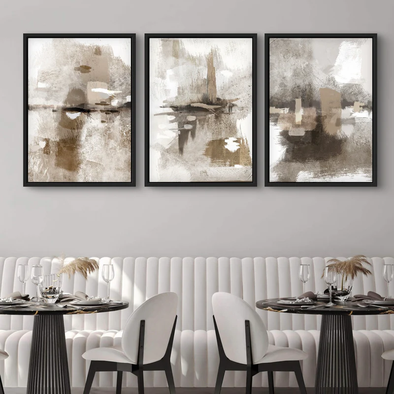
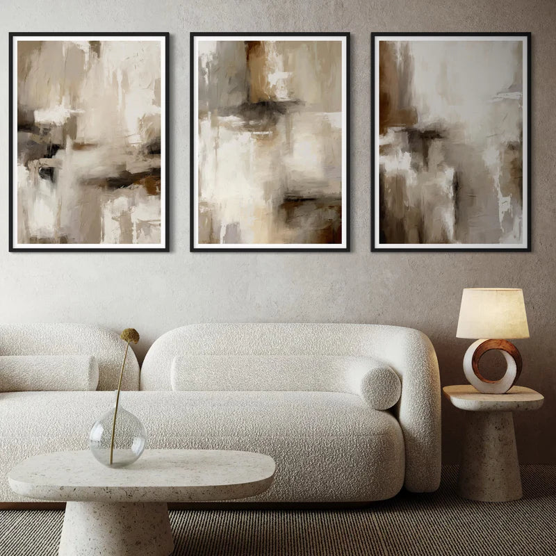
If you're building a gallery wall for the first time, starting with a curated set of three is genuinely the easiest route. The artist has already done the hard work of making the pieces sit together, so you're not gambling on whether that teal in one painting clashes with the teal in another. From there, you can build outward with individual pieces if you want a larger arrangement.
Mixing Sizes and Orientations
A gallery wall made entirely of identical frames in identical sizes can look smart — very hotel lobby — but it's not usually what gives a room soul. The arrangements that feel most natural mix things up. Try pairing a larger landscape piece with a couple of smaller square canvases, or setting a tall portrait format alongside a set of two smaller works.
That said, keep one element consistent. If you're mixing sizes, keep the frame finish the same throughout — all black frames, all natural oak, or all white. This is the quiet trick that makes an eclectic arrangement look intentional rather than chaotic.
Planning the Layout Before You Pick Up a Hammer
Do not — and I say this with love — just start nailing things to the wall. There are two methods that actually work, and neither of them involves guesswork.
The Paper Template Method
Cut pieces of kraft paper or newspaper to the exact dimensions of each frame. Use painter's tape (the low-tack kind that won't pull off your paint) to stick them to the wall. Step back. Live with it for a day. Move things around. This sounds tedious, but it takes fifteen minutes and saves you from a wall that looks like Swiss cheese.
The Floor Layout Method
If you have enough floor space, lay everything out on the ground first. Arrange and rearrange until you're happy, then photograph it from above. Use that photo as your map when you move to the wall. This works especially well for larger gallery walls where you're combining five or more pieces.
Whichever method you choose, a couple of spacing rules will serve you well. Keep 5-8cm between each frame — close enough that the pieces read as a group, far enough that they each have breathing room. And hang the centre of the arrangement at roughly 145cm from the floor, which is standard gallery hanging height. If the wall is above a sofa or headboard, bring the bottom edge of the lowest frame to about 15-20cm above the furniture.
Sizing Guide: What Goes Where
Getting the scale right is half the battle. Here's a practical breakdown based on common spaces in UK homes:
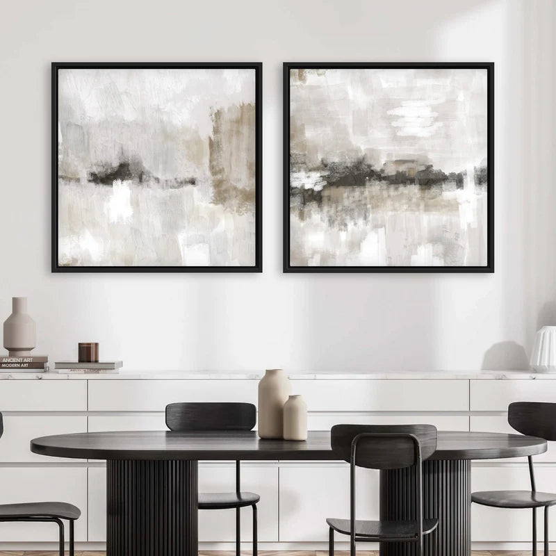
Above a standard 3-seater sofa (around 200-220cm wide): A set of three pieces in the 40x40cm to 60x40cm range works beautifully. Alternatively, one larger piece (100x50cm or similar) flanked by two smaller squares gives a lovely asymmetric balance.
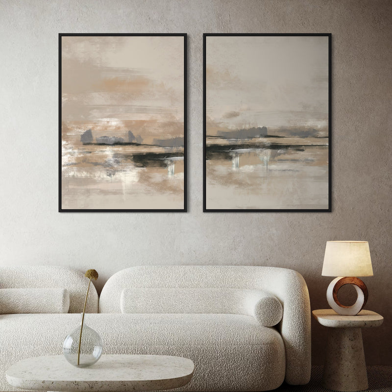
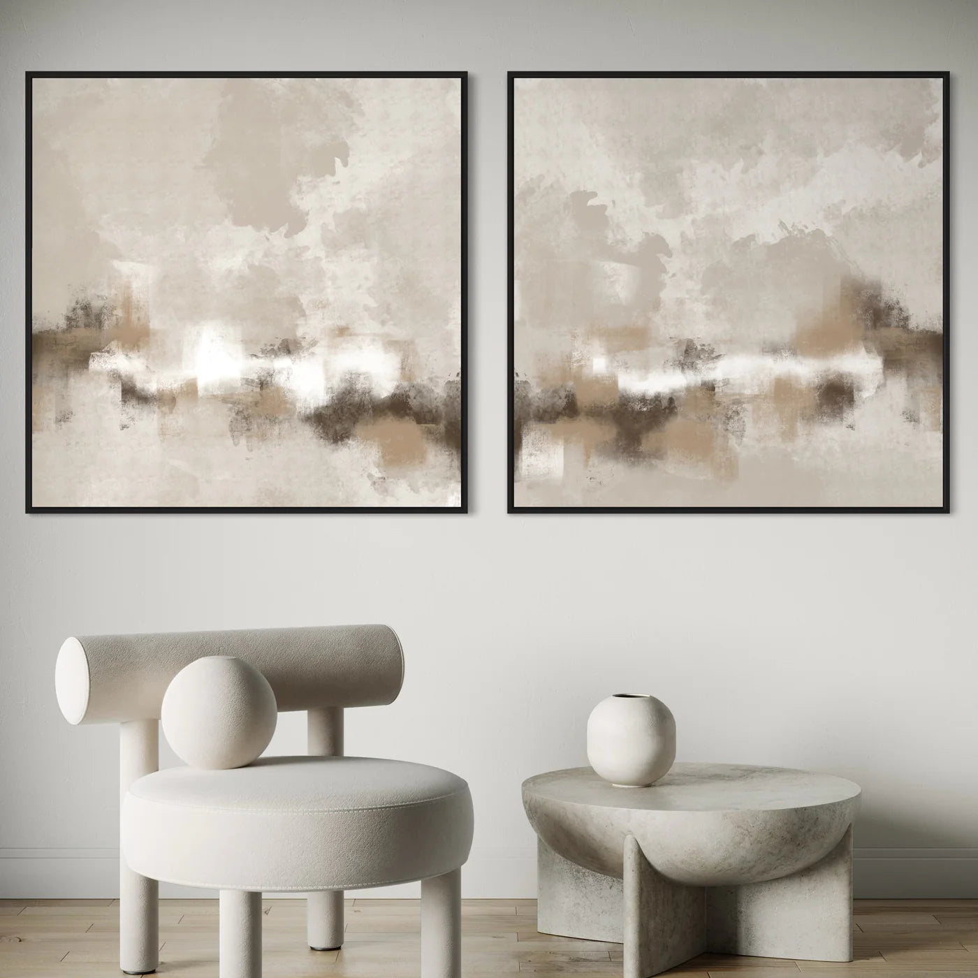
Above a bed (king size, 150cm wide): A set of two in portrait or landscape orientation is the classic choice — clean and balanced. For something bolder, a single panoramic piece in the 150x75cm range makes a real statement.
In a hallway or staircase: This is where a staggered, organic arrangement shines. Mix three to five pieces in varying sizes, stepping them up or down to follow the line of the stairs. Smaller pieces (30x30cm singles) work well here because hallways are typically narrow and you view the art from close range.
Above a console table or sideboard: Keep it proportional. A pair of square canvases or a single landscape piece usually strikes the right note without competing with whatever you've styled on the surface below.
Common Gallery Wall Mistakes (and How to Dodge Them)
After years of seeing gallery walls go right and go spectacularly sideways, these are the pitfalls that come up again and again.
Hanging too high. This is the single most common mistake. People hang art at their own eye level while standing, forgetting that most of the time they'll be viewing it while seated. When in doubt, go lower than you think. Your future self, relaxing on the sofa, will thank you.
Spacing too widely. When frames are 20-30cm apart, they stop reading as a group and start looking like individual pieces that happen to share a wall. Tighten the gaps. That 5-8cm range keeps the arrangement cohesive.
Overthinking the "match." Your gallery wall doesn't need to be a perfect colour match to your cushions, your rug, and your curtains. Abstract art should bring something new into the room — a colour you wouldn't have chosen for soft furnishings, an energy that shifts the space. If everything matches too precisely, the room feels showroom-flat instead of lived-in.
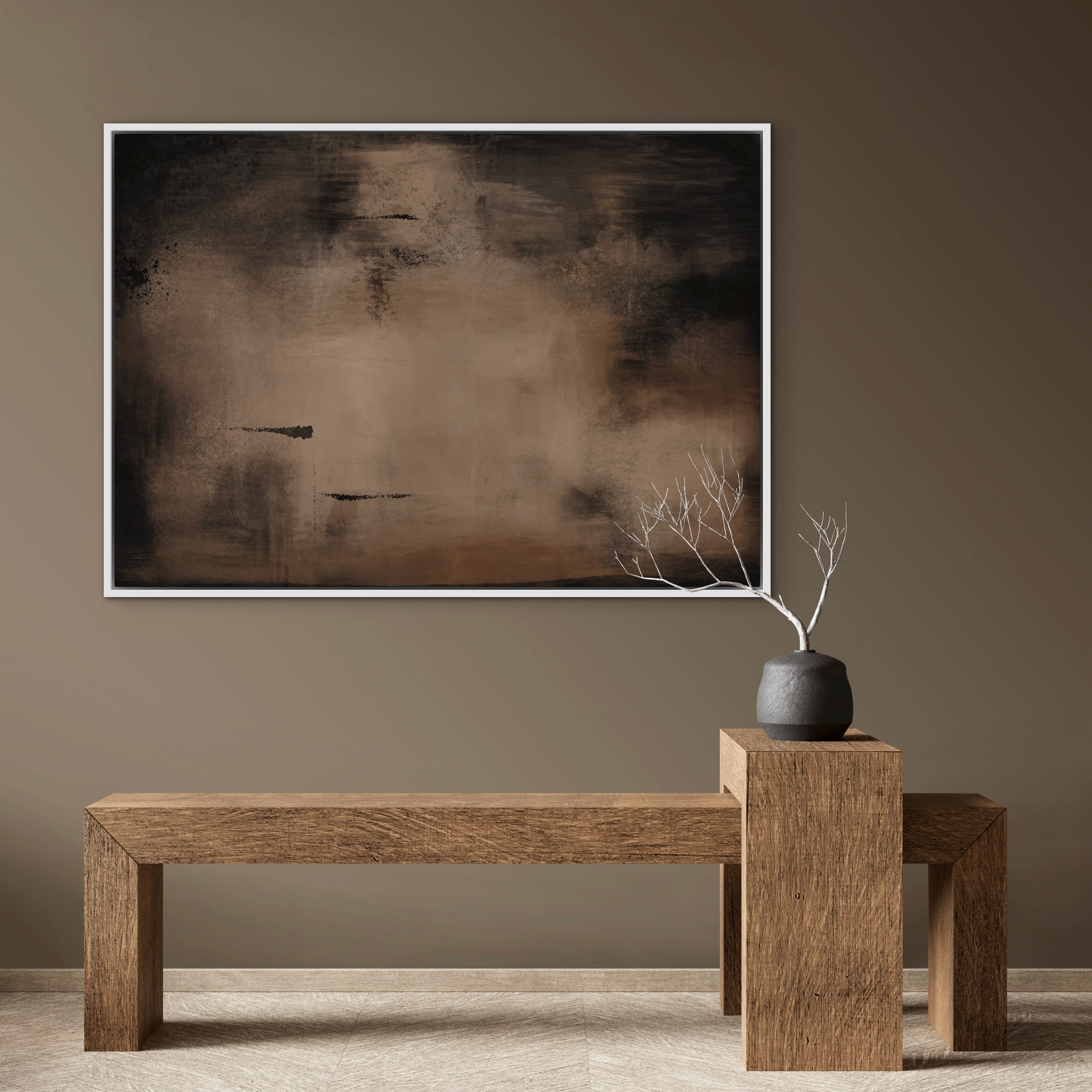
Forgetting the frames. Mismatched frame styles — one glossy black, one rustic wood, one thin metal — can undercut even the most beautiful art. Consistent framing is the simplest way to unify a gallery wall. Whether you lean towards black, natural oak, or white frames, commit to one finish across the whole arrangement.
Not accounting for lighting. A gallery wall on a dark interior wall with no nearby light source will disappear. If the wall doesn't get natural light, consider a simple picture light or adjustable wall-mounted spots. Handcrafted canvas has real surface texture — the kind you can actually see when light rakes across it — and good lighting makes all the difference.
Living with Your Gallery Wall
Here's something nobody tells you: a gallery wall isn't finished when you hang it. It's a living part of your home. You might swap a piece out seasonally, or add to it over time as you discover new artists or fall for a new colourway. That's the beauty of building an arrangement rather than committing to one enormous canvas — it evolves with you.
If you've started with a set of two or three, you've got a strong foundation. Six months from now, you might find a single piece that complements them perfectly. A year after that, you might rearrange the whole thing. The nail holes are tiny and the filler is cheap. Don't let the fear of impermanence stop you from starting.
A Note on Handcrafted Pieces
One thing worth mentioning — and this is genuinely relevant, not a sales pitch — is that handmade abstract art behaves differently on a gallery wall than mass-produced prints. Each piece has subtle variations in texture, brushwork, and depth that become more interesting when you group them. You'll notice details at different times of day as the light changes. It's the kind of thing that makes a gallery wall feel like something you curated with thought, rather than something you ordered from a catalogue and stuck up in twenty minutes.
Ready to Start Your Gallery Wall?
If you're itching to get going, the simplest place to begin is with pieces that are already designed to work together. Our sets of three are the most popular starting point for gallery walls — three coordinated abstract canvases that give you instant impact without the guesswork. If your space is more compact, or you prefer a cleaner look, our sets of two pair beautifully above beds, console tables, and in smaller living rooms.
Every piece is handcrafted in our London studio on real canvas, stretched and framed — ready to hang the moment it arrives. Pick a wall, grab your tape measure, and see where it takes you.